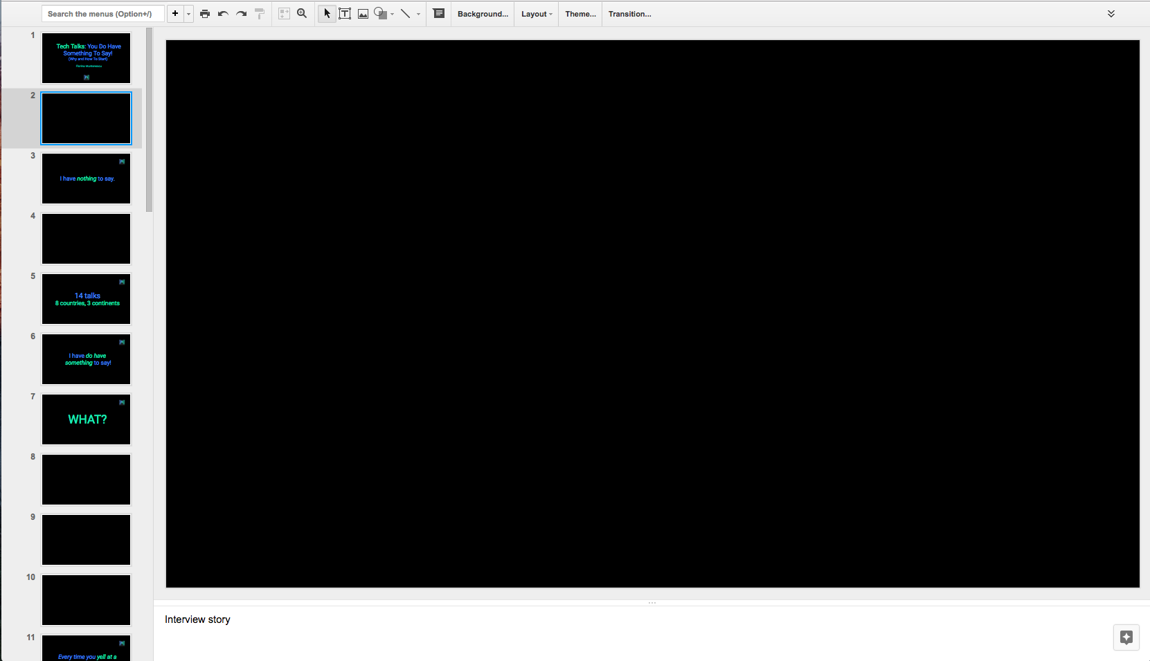
A Public Speaking Experiment: Blank Slides
3 minutes readMy talk at the International Women’s Day event, organised by Women Techmakers gave me the chance to share my story about public speaking and also to try something new: using blank slides.

The time allocated for my talk was 25min + 5min for Q&A. Since this was a non-tech talk that didn’t require much visual support, I decided to combine text slides with blank slides. You can find the final deck here.
My strategy was this:
- Use blank slides for the moments when I’m telling my story. Like this, the focus of the audience is on what I’m saying.
- Use text slides only for quotes and main take-aways. These would only appear in the key moments of my presentation and the audience should focus on them. The effect of the take-aways is now amplified, since these are the only parts that the audience both hears and sees.
Usually in my tech talks, I tend to have one slide per idea. So I kept the same approach now, even if my slides were blank. This also gives me a sign of when I should have a small break in my speaking flow.
There are a few possible downsides:
- The IT audience is used to talks where they always have a visual guidance, so having a black screen all of the sudden can be a surprise. I saw this effect when rehearsing my talk with a friend. But, after the initial surprise, I could see that my strategy is working: he was only looking at the slides when there was something there and the rest of the time, his attention was on what I was saying.
- If the audience gets distracted by their phone when they’re trying to pay attention to the talk again, it will be harder to grasp the context because of the lack of visual aid. To diminish this effect, the time between text slides was only a few minutes.
Talk time! How did things go?
From a speaker’s perspective:
- Given that the slides are blank, I had no more support for what’s coming next in my talk. I had to rely either on the speaker’s notes or on knowing the talk really well.
- The tendency of looking at the slides and turning the back to the audience decreased so the communication with the audience improved.
- I could see that the audience was looking at me more and at the slides only when there was something there, which was expected. People didn’t seem to get distracted that much, which was great!
- The importance of the body language, tone of voice and speech pace increased. So I tried to use all of these to give more meaning and power to my words and also to connect more with the audience.
From the audience’s perspective:
- Like my rehearsal audience, they were surprised the first time when they saw the blank slide. They thought that there was a technical issue and the slide is not loading.
- After the first blank slide everything was ok.
Blank slides — yay or nay?
Yay!
- The slides with text or image become more powerful.
- The speaker has a better control over the audiences’ attention, by removing the distraction that can be caused by slides.
- Great in short or really engaging talks, where the audience doesn’t have the time to get sidetracked by phone/email/social media.
Nay!
- If the audience is not-used to blank slides, the first one will be a surprise and might disturb the audience. One possible solution would be to use the blank slide very early in the talk, maybe even from the first sentences.
- Using blank slides means that you don’t have any support for what’s next in your talk. So, knowing the order of your ideas, becomes more important and the preparation time might get higher.
Have you ever used blank slides in a talk? I would love to know more about your experience, the problem faced and the solutions you found.
